
Anatomy of a Book: Introduction to Paper Weight and Size

This closeup from Ottavio Leoni’s 17th century Portrait of cardinal Scipione Borghese depicts a folded pamphlet of a presumably small weight, and clearly small size.
Hello readers, and welcome to the second installment in our monthly Anatomy of a Book series. The series has been very well-received, and we are delighted to offer a new post on the 28th of each month for the entire year.
As we expressed in our previous post, our focus upon anatomy allows us to approach a book as a body, one constituted by multiple interworking parts. Last week, we detailed the heart of a book in the guise of the text block: the pages, as the inner core of the book, serve as vessel through which the lifeblood of the entire work is carried. The text block is the locus of a book’s content, with it’s expressions circulating through the rest of a tome as they inform matters of color choice, binding style and more.
Yet, just as with the or human or animal heart, fibrous and cellular constituents form this part of a book. Layers of paper, folded into folios and signatures, serve as the flesh-like tissue that layers itself into the organ of the text block. Yet, despite its utter simplicity, just one of these individual pages of paper itself contains an entire anatomical world.
It is here that our introductory journey takes us today, where we will be examining paper weights and sizes.
Paper is a fibrous medium: in light of our discussion of bodies and anatomy, it is apt to remember that paper is quite literally composed of cellular material, as well as organic and fibrous artifices wrought from plant flesh.

A Richard Wheeler photograph details the fibrous makeup of paper. The caption notes this as a “Micrograph of tissue paper. Illumination is by ultraviolet light causing autofluorescence of the fibres.” CC attribution.
By undergoing numerous forms of harvest, process, and treatment — too multifaceted to be covered here — the bookmaker is offered a multitude of paper forms. As with all the components of the book, this spectrum of choices can be narrowed to a selection that speaks to the spirit of a given book:
It may reflect the coarse rawness of a book’s content, or echo the smooth and glossy sheen of a refined and polished work. Differing weights may add a heft or lightness to a book which imparts various elements of practicality or impress.
In any case, a lexicon for describing these choices exists, and it is here that we draw the reader’s attention.
A macro photograph elegantly displays the thickness of paper sheets. This 2022 photo was taken by Jordan Mudrack Photography. CC attribution.
The most universally encountered term in the realm of paper weight — often seen, but less well understood — is gsm, or grams per square meter. Sometimes referred to as a paper’s grammage, this term is used to denote the overall weight of the paper stock at hand.
Quite intuitively, the higher the gsm number, the greater the overall weight of the paper. It is important to note that grammage is utilized regardless of a paper’s given thickness. Such thickness is referred to as a paper’s caliper.
To pause and offer a general frame of reference, consider the typical sheet of office paper: let us assume that it measures 80 gsm. We will discuss size shortly, but the common A4 size of office paper — which is 1/16 of a square meter — would therefore weigh 5 grams.
What then are some standard examples for other paper stocks used for books and book-adjacent works? A helpful list we’ve constructed below will offer a frame of reference:
35-55 gsm: Highly thin paper, often utilized in newspapers, non-glossy periodicals, etc.
55-70 gsm: A slightly thicker paper that can be found in the most basic of notebooks, stationaries, and similar note-taking tools.
70-100 gsm: This increasingly durable and practical weight is most commonly found in office stationary, printer paper, and other executive or legal forms of stock.
100-140 gsm: This weight is most commonly found in the pages of the average fiction or non-fiction book. Finer print and higher-end books will often lean towards the far end of this spectrum. Quality increases here in regards to sturdiness, fortitude, tactile and textural qualities, and so forth.
140-200 gsm: Here, we find a further increase in weight and durability, making this area of weight particularly useful for flyers, fine posters, certain art prints, and bills.
200-350 gsm: While still pliable, this stock begins to firm up noticeably. It lends itself to medium-thickness flyers, posters, signage, paperback covers, basic business cards, and standard card designs.
350-400 gsm: As we reach the further ends of the gsm spectrum, we find paper used for thick and high-quality cards, certain fine art prints, heavy flyers, and so forth.
These are but a few examples, and wiggle-room, overlap, and stylistic preference cause these differences to blur often.
It is important to consider gsm for many reasons. For example, the practical or aesthetic application of a book must be considered:
Is the book an aesthetic object, perhaps a fragile one that will maintain a safe home on a shelf or a display? Perhaps here a lighter gsm measurement lends itself to the book at hand. Consider, now, a book that will be taken into the field for practical or rugged use. In this instance, a higher gsm measurement may ensure longevity and durability — while also aesthetically reflecting its purpose.
We’ve now covered some of the basics basics of book weight, and these are found in the occult publishing milieu more often than not. But what can be said of size? Likewise to weight, a number of concerns with practicality, application, and aesthetics must be taken into account with size. Like gsm, paper size has been standardized in many ways across many paper and binding cultures. A common terminology is also used.

In this anonymous work cataloged as Flowers with White Paper Sheets, long sheets of folded paper can be seen draped amidst a still scene. Public Domain.
Before we explore some basic terms, however, we must note that a book is typically measured by the height and width of a leaf of paper, or sometimes its cover.
A number of terms represent these sizes, and once again we find that commonly used words derive from Latin numerical terms. For example, in the common American standardization, the quarto size stems from the Latin term quartus, meaning fourth.
Now recall that, in our very first Anatomy of a Book post, a single sheet of paper folded once along the long edge creates a folio — from the Latin folium meaning leaf. This is essentially a two-page book whose outward facing sides form a basic front and back cover.
Now, envision this paper folded yet again, also on the long edge. Here, the aforementioned quarto — containing four folds — has been created. This recursive folding serves as the principle for sizing paper in such a manner as seen often in North and Latin America.
In the United States, the American Library Association has created a simple image which displays some of the most common of these terms and their associated fold numbers and measurements. It can be seen below:
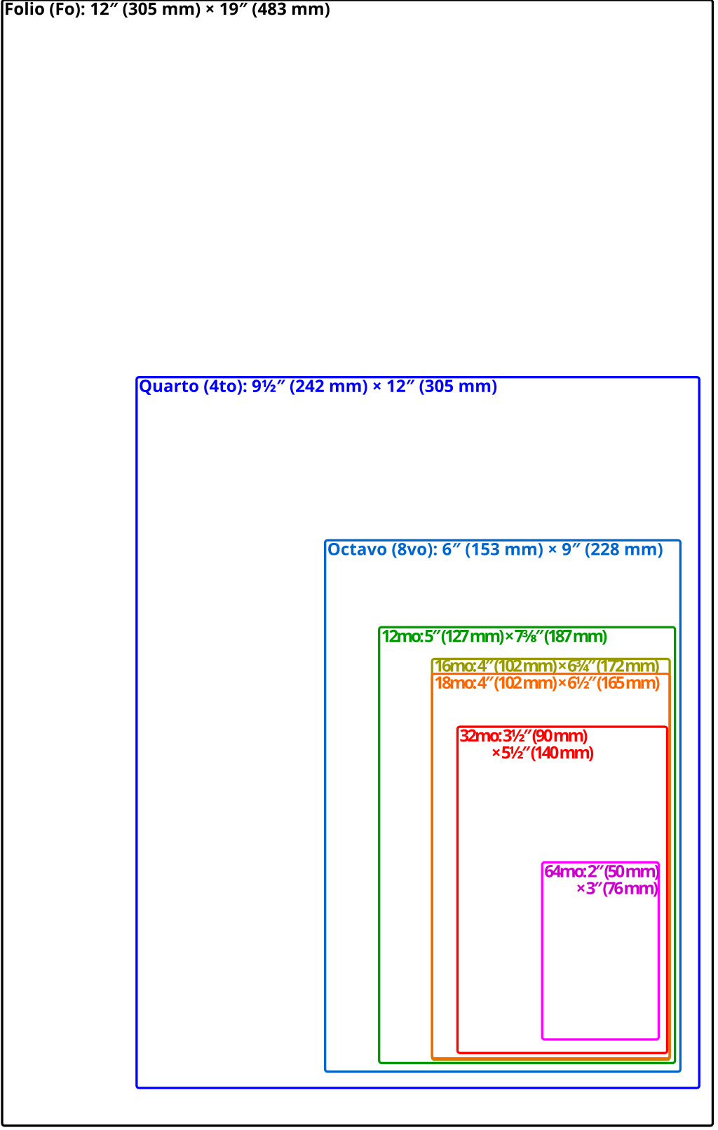
Via the American Library Association.
Various such standardizations exist for paper size and measurement, and to detail them all here would be laborious for an introductory post. However, one standardized form that is extremely useful to become familiar with is ISO 216.
This standardization is pertinent for readers outside of North and Latin America. In countries like the United Kingdom, for example, a different denotation is most commonly used stemming from ISO 216. In this schema, we encounter terms like A4, and A5.
This standardization schema classes paper and book sizes into A, B, and C criteria. This criteria is defined by both by size of the unfolded 0 sheet (As in A0), but also by what is called an aspect ratio. This is a ratio which allows for the scalability of size by halving the paper at every fold. This ratio is such that, upon folding one time in half, an A4 paper becomes an A5 paper.
A similar diagram appears distinctly different upon examination. One bookworker has offered the following diagram to the public domain:
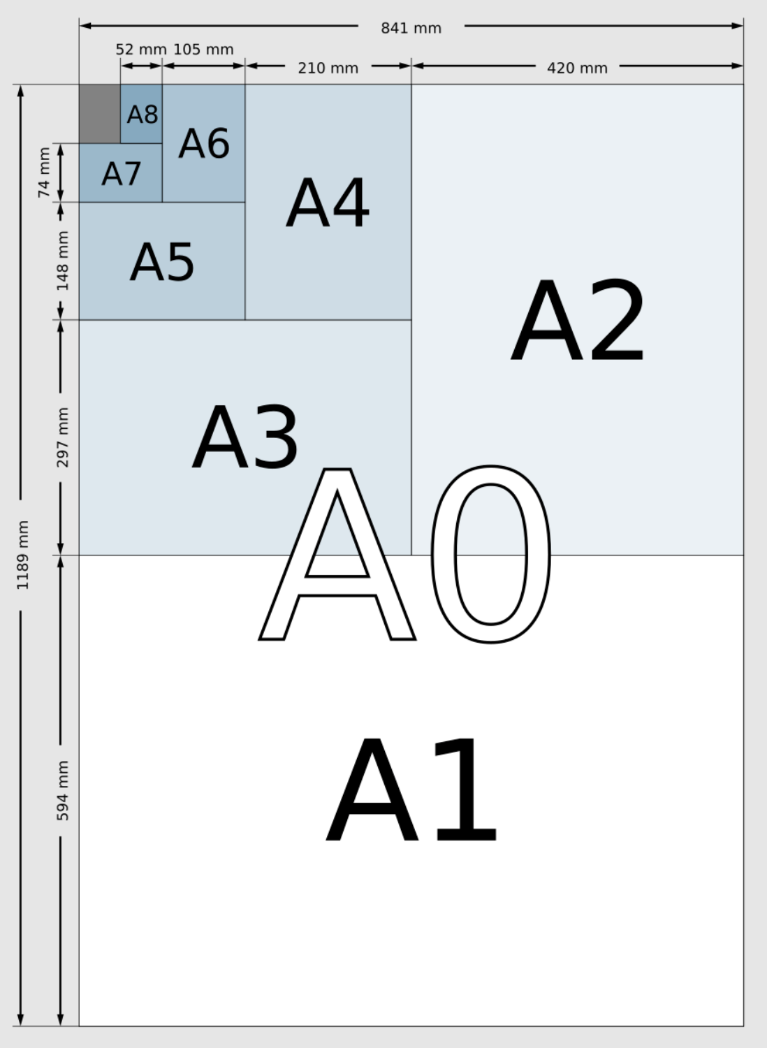
Via Wikimedia Commons. Public Domain.
The above forms of weight and size, and their representation as such, detail just a handful of the many conventions and considerations to be taken into account when selecting a book. This article is but a mere introduction. However, it will no doubt orient the reader to some commonly used frameworks for understanding what they can expect when ordering something like a “hardcover text in octavo format with 120 gsm cream paper.”
A general illiteracy of these matters has sadly left many a reader unsure of — at worse, disappointed in —their selection of a book. It is our hope that this small guide will prompt our readers to explore more eagerly the vast galaxy of paper sizes, weights, conventions, and styles for themselves. Numerous online resources, many free and open for exploration, exist upon a cursory search for book sizes and weights.
To reiterate an original goal set out in our first post: we seek to expand and enhance not only the appreciation of variety and form found within occult publishing, but also to aid the reader in selecting the book that will best fit their needs, desires, and preferences.
Next month, we will discuss the processes by which content is impressed upon a book via printing: offset lithography, digital printing, letterpress, and more all offer unique and often tactile means of transferring content on to the. pages of work. Printing can be understood anatomically as reflecting the inner quality of a book: its mind, personality, character, and disposition.
We look forward to sharing this exploration with you, and we hope you’ve gleaned something today that will aid you in your next book find or acquisition.
All the best,
— The Occult Library staff.